How Your Current Reports Are Failing You
Don’t let what’s critical to your business become stagnant.

Reporting – we discuss it in meetings, it’s part of our daily review, and it may even provide knowledge externally to the public. It’s a necessity for any business, yet still, reporting often gets neglected when immediate needs of day-to-day productivity take priority.
There’s no question it can be difficult for businesses to accurately prioritize when everything is deemed critical. And it’s true – every aspect of your business is critical for it to function as it should; and therefore, it’s not about figuring out what should be focused on, it’s about determining when it should be focused on. Serving as the backbone of your organization, there is never a time when manual or digital reporting should not be a central focus; however, foundational and solid reporting makes it all the more possible to uncover that when behind the critical matters of your business so that you can properly triage and give attention where it’s most important.
Even so, saying you have reporting in place or implementing reporting into your team’s morning routine does not guarantee you’re getting the most out of your day or solving those prioritized issues as effectively as you can be
As daunting as it can be, all businesses should take a step back from time to time and assess with a keen eye the ways in which their reporting is clearly supporting their successes, as well as the ways in which it may be hindering or completely working against them. To give you a head start, our team at Bearex pulled together 5 main ways your current reports may in fact be failing you, and it all comes down to Who, What, Where, When, and Why.
1. WHO: Decisions are not meeting their full potential
A quick, but effective assessment to check if your existing reporting system is misleading your team is to first simply ask – is this going to the right people? Later, we will talk about the right timing and the right data sources, but those making decisions off the reports themselves is a pivotal place to start.
If certain leaders and decision-makers are not given proper access to the reporting that is imperative to their job and the success of the team or greater operational performance, then critical data is essentially being left unattended and slowly becoming a wasted resource.
Do you have the proper architecture set up to bring accessibility to the forefront – to organize reports and data sources in a way that mirrors your internal structure? Full accessibility to everyone is not helpful either as it can overwhelm and cloud judgment for those that don’t need to see everything; therefore it takes careful understanding of the functions certain roles on your team have where reporting can be sanctioned strategically.
2. WHAT: You don’t know what you don’t know - only getting part of the story
One prevalent way your reports may be failing you but can often fly under the radar is the sole fact you are not connecting to all data possible and relevant to your team. Historical shifts in change management and leadership may lead to this natural oversight, causing time to go by without realizing there are informational gaps. This could be from missteps in data management, new system integrations, natural disconnects or convoluted data access, or a myriad of other reasons.
Just because nothing has changed doesn’t mean there shouldn’t be routine status check-ups, and even if change has happened, that doesn’t mean there shouldn’t be maintained a set of checks and balances.
This may be giving your business an incomplete and therefore, false perspective into current performance levels.
Half the story is almost just as misleading as having no story at all, because decisions that should have otherwise been made could in turn be hurting you.
3. WHERE: Lack of integrity
When busy days turn into tireless weeks, problem-solution mindsets to fixing issues may quickly become the norm. While this isn’t a fault to your business short-term, it can hinder your long-term growth if no time is ever allotted for insights of the issues themselves. So often these are related to problems that fall under the greater umbrella of data integrity as a whole..
Data integrity, as defined in this HBS article, is the accuracy, completeness, and quality of data as it’s maintained over time and across formats.
Maintaining and protecting the integrity of your company’s data is an introspective process that requires understanding where the concerns arise from in the first place, not just their quick fix. Over the course of time, these problems can snowball when not addressed immediately, leading to greater confusion when trying to unravel at the source that may not be easily spotted. Whether it be a threat to your data security or perhaps a missing set of data translated across departments or documents, it’s important to work towards knowing where your data is missing the mark, or where opportunities exist to strengthen your data integrity.
4. WHEN: The data is not reflective of now
To follow this train of thought, you may in fact have all the data you need and available to you, but it also begs the question of when? Are there automations at play that are empowering the data sources you connect to every day to be consistently up-to-date, or if necessary, in real-time?
Static data, even if whole and complete, is still limiting your reporting from meeting its full capabilities. This is not to say past data is not still valuable to reporting, it is necessary for building awareness for preventive or proactive measures of decisions for the future; but no business should only be looking backwards. If you can take advantage of updated information through data automation, you can use today’s data the moment it’s being captured, and perhaps open the door to more complex measures for effective decision-making, such as predictive analytics.
5. WHY: Reliable, but not representative
Data is not solely about the numbers – it’s also about what the numbers say and giving us the answer to why? Why is performance down? Why are we seeing discrepancies year over year? Why did revenue increase in one faction but not others?
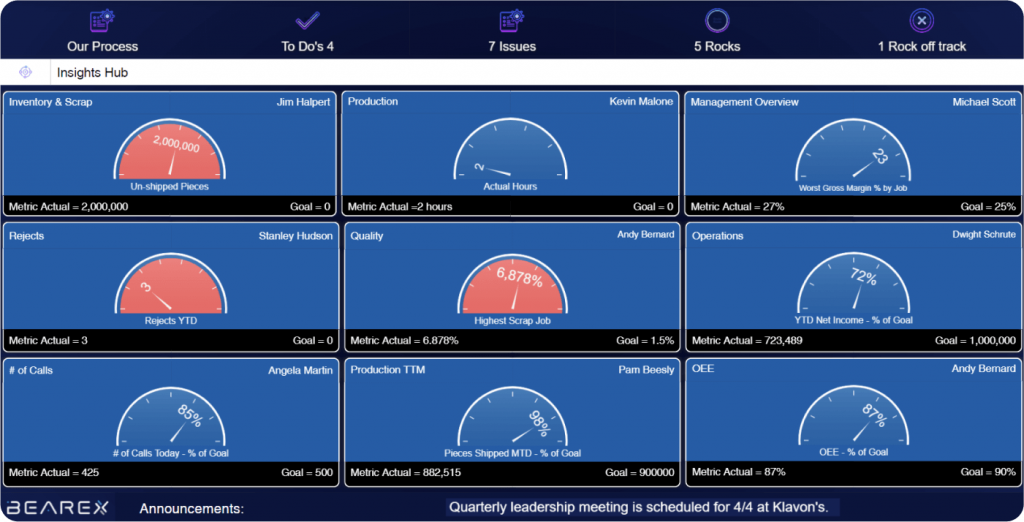
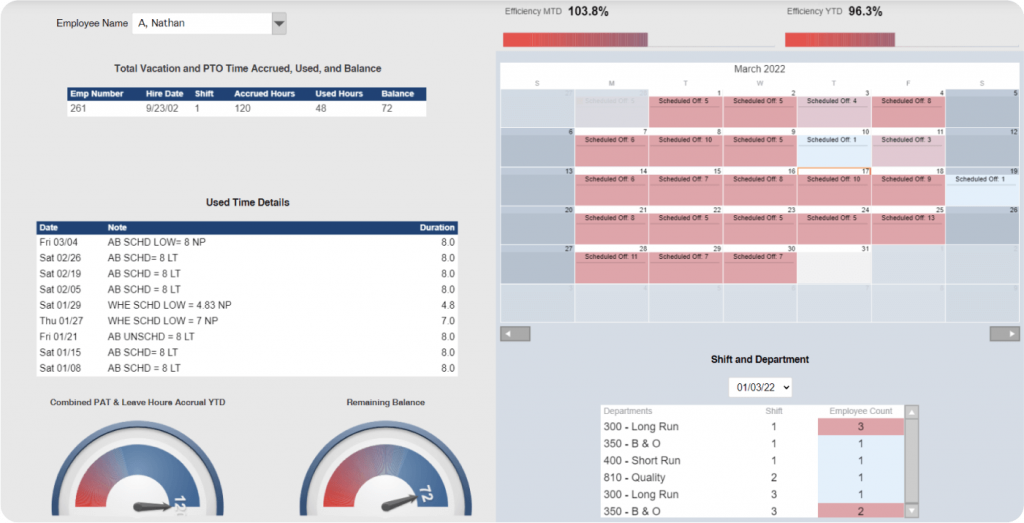
Again, to understand the full story however, you must be able to see the data and not just hear what it’s saying. Data visualization is a key component to stripping the numbers down to the core – to the measurables that are driving the results you suspected were coming from another source, to the patterns and trends in your data, and to the focus areas that deserve alerted attention.
Extracting the most out of your data visualization requires a devotion to your data and its multiple facets, such as color theory and selecting representative charts and graphs.
The use of certain colors, how they are combined, their intensity, and where they are placed in relation to one another all play a vital role into the psychological response humans have. Charts and graphs, similarly, each have a unique way of communicating the data they are holding. Some are better built for comparison, others for distribution, as Google explains here.
Depending on what your data is conveying and the goals you are trying to achieve and make decisions off of, no one graph or one color is universal to the needs of each data point and source. If you already use data visualization, take time to assess whether the choice of your graphs, as well as their design, accurately align with the intent of your measurables and how they are defined to determine success. If you are not yet bringing visuals into your reporting, consider how this can add emphasis and allow your data to depict a more compelling story of your data.
Reporting for Business
While this is not a comprehensive list of the gaps that can exist in your data and cause later issues to your reporting, it shows how something as standard and familiar as your daily reports still needs reassessing from time to time. Reports work to provide you with the “check-ins” you need for your business, so it’s important they too receive them and don’t go stagnant.
If you’re ready to refresh your reports but want to know where to get started, reach out to us at Bearex today to learn more on how you can focus on the matters of your business while still giving your reports the attention they deserve. We’re here to support you every step of the way and will make the tedious steps in doing so that much easier.
Ready to turn your reporting into revenue-driving results? Contact us today to get started.
Author

Tom Jurasek
Tom is the CEO & Visionary at Bearex, empowering data insights. With a background in CPA and CFO for-hire, he strives to simplify and help organizations have the information needed to make an informed decision.


